Some of the publications that I’m particularly fond of made me realise I have consistently tried to find ways to make content available on different levels of detail.
People should be able to quickly find the core of the information base or narrative. Nobody likes to waste their time. But since every person’s level of interest is different, there is no one ideal presentation, and unlocking deeper levels of the content should be as natural an experience as possible.
VPRO Trees
A mobile app that explored how trust in journalism might be rebuilt through transparency and participation.
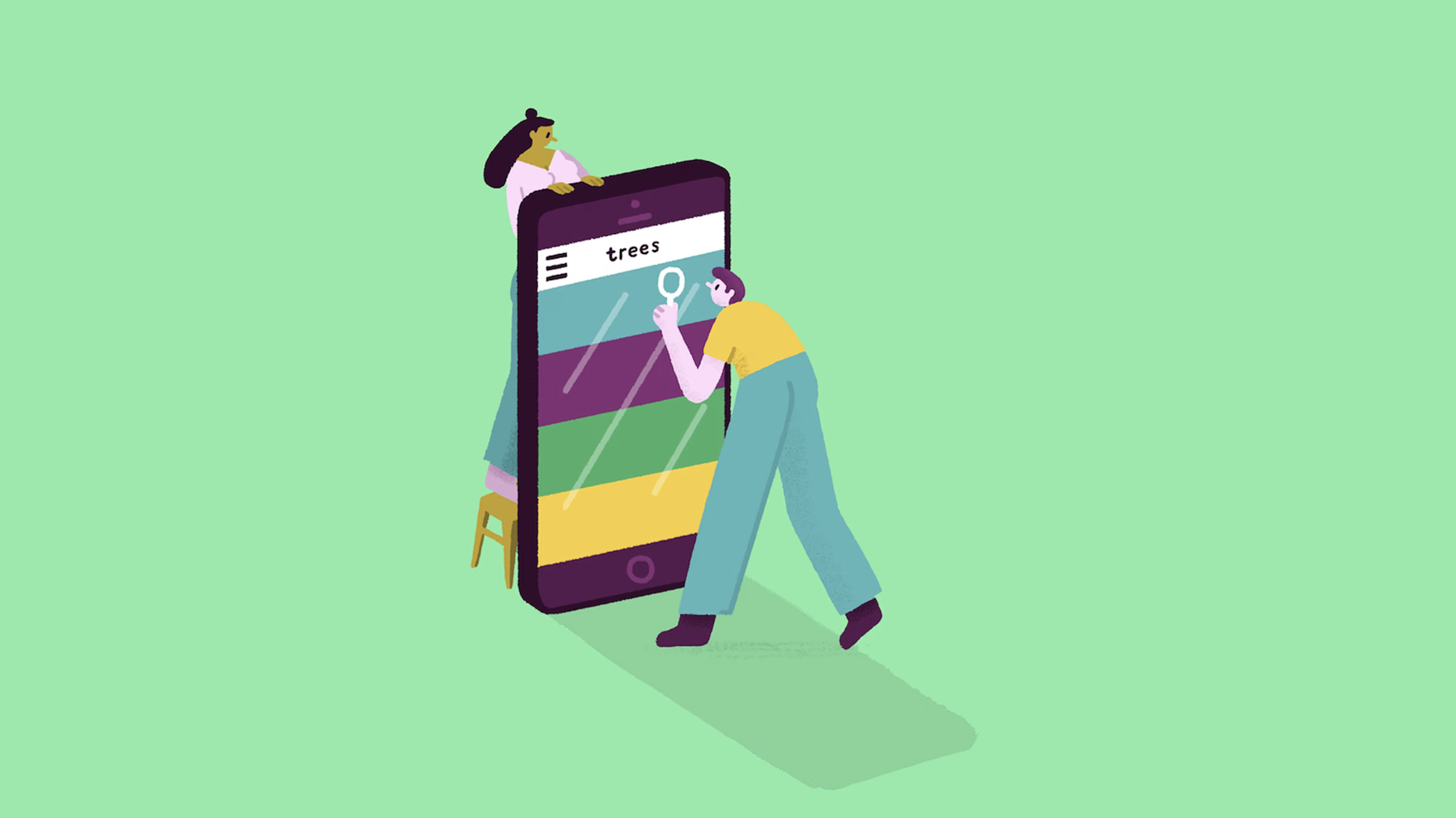
Three young journalists each pursued an investigation from their own angle, documenting their progress in short audio episodes. Visitors could actively contribute experiences, background information, and suggestions for next steps. Each week, the journalists met under the guidance of senior journalist Clairy Polak to decide where the research should go next.
The app continued to evolve, with increasingly rich forms of audience interaction, ranging from closed yes/no questions, collecting statistical data, to open questions or requests for first hand experiences that audience members could answer either by text or by voice. The journalists would treat the audience submissions as research that could lead to next steps in the investigation.
The project ran for just one year. In 2026, I was given the opportunity to reconstruct the app in a week, using recovered audio, illustrations, and a handful of screenshots, with the help of AI.
2017 – conceptualization, interaction design, visual design, (re)development
Interactieve VPRO documentaires
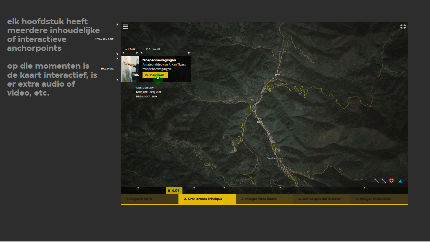
Srebrenica (Argos), Langs de oevers van de Yangtze (Ruben Terlou) [about], Standing Rock (Laura Stek) [capture], Gliphoeve (Daan Dekker en Maartje Duin) [about].
The Argos documentary was the first in a series of interactive documentaries built in the VPRO scenarioplayer: a format in which linear narrative is enriched with deeper layers of video, audio, and imagery. It allowed viewers to grasp the core of the story quickly, while also giving them the option to dig deeper through contextual excursions.*
The scenarioplayer was later further developed for other productions and also integrated into an interactive map for Ruben Terlou’s first journey through China, where linear storytelling and geographic navigation together created a layered viewing experience.
2015 – conceptualization, interaction design, visual design, development
Nederland van Boven

For the documentary series, we developed an interactive map that made complex datasets accessible and easy to explore. Using sliders, visitors could uncover relationships between themes such as mobility, building density, and biodiversity, from a national overview down to highly zoomed-in areas.
The site combined the series’ linear narrative with a more open, investigative mode of viewing, supplemented by additional data visualizations in video.
2014 – conceptualization, interaction design, visual design
3voor12
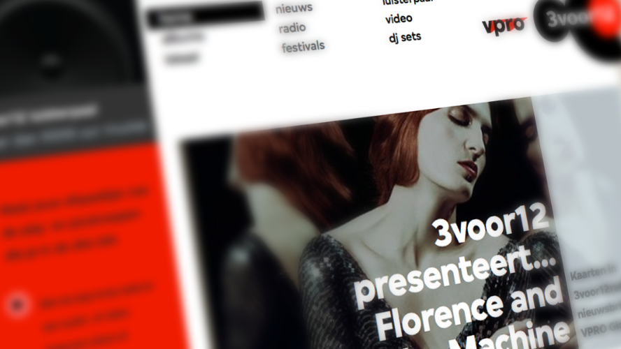
The music platform 3voor12 began as a protest site, but grew into a full-fledged platform for music journalism, with reviews, feature stories, and original live recordings. As social media became more dominant, its content was increasingly spread across different channels, while editorial capacity came under pressure. Choices had to be made.
The answer was the 3voor12 feed: a redesigned homepage that brings all of these forms together. Alongside articles on the site, it also displays external publications such as Spotify playlists, Instagram reels, and YouTube shorts, without requiring any extra editorial work. One continuous stream that makes the full breadth of the platform visible.*
2012 – conceptualization, interaction design, visual design
In Europa

The stories from Geert Mak’s television series In Europe were brought online through time and place. Visitors could navigate through the history of a country or region, or look across Europe to see simultaneous developments within a specific period.
The site offered the full episodes, but the map exposed the individual stories, creating a more exploratory way of watching.
2007 – conceptualization, interaction design, visual design, development
Cinema.nl
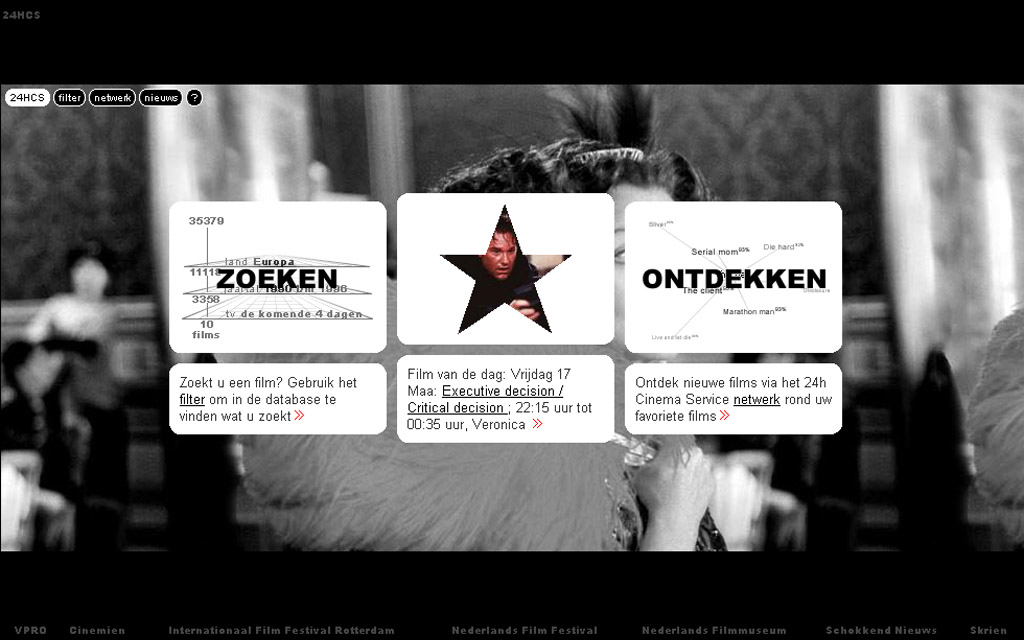
One of the first Dutch-language film platforms where users could actively shape their taste through ratings. Based on those ratings, the site offered personal recommendations and alerted visitors when relevant films were being broadcast on television.
What began as a database evolved into a editorial platform with reviews, interviews, and background stories; the film and person pages from the database formed the connective tissue, while the personal features remained.*
1998 – conceptualization, interaction design, visual design, development
* Many original (functions of these) websites were lost in a content migration, and are to be brought back later.