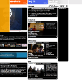
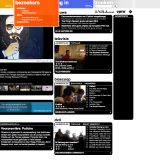
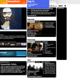
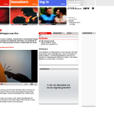
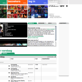
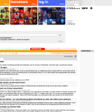
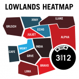
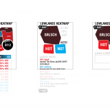
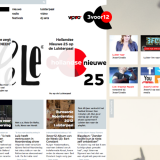
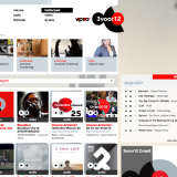
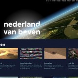
 Right after I got my degree in graphic design in 1997 vpro took note of my graduation project and hired me to experiment on then uncharted territory, the internet.
During my last art academy years the internet was a purely text-based communication medium, aimed at and developed by scientists. We soon learned that the table tag, a tool to create readable overviews, could be used as a layout tool. When the background tag expanded to tables the only thing missing was real typography.
The first thing we started to experiment with was faux line-height, by search-replacing all spaces in texts with larger font size spaces. We didn’t have to worry about databases or content management systems. Content and code were still one. Of course wordspacing also increased, but it gave your page an instant air of quality. Just don’t click <view source>.
Today
 By now most of our experiments are either lost or overtaken by innovation. Some of it has become institutionalized and is integrated in our current projects. Here are some of the steps we took along the way.
1996 – hardcoded html
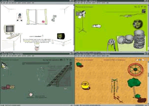 Turbotuig was a live video broadcast and multiplayer game. Turbotuig started as a series of television interviews with computer-savvy children. Each got their own room on the website which was represented by fluid scaling illustrated house interiors and playground. Rich kids got big rooms on their large computer screens, kids with smaller screens got a smaller room. All furniture had hover states, that was something fancy at the time, and users could navigate through the site by using the doors.
In the second season the television program directed the kids to the website, where the show was continued with a live RealVideo stream. Kids could pick their own avatar and move it around between the other kids in the ‘studio’. The tv makers used this to create a live quiz game: kids could answer the question by moving their avatar to the left or the right of the studio. Only a few brave kids would stay on their own side when all the other kids moved to the other. It was hilarious.
Lessons learned
Keeping the hardcoded website up to date, especially the playground which linked to online games, was a lot of work. By lack of available content managment systems it required graphic and html skills which inevitably lead to a website with lots of dead links. Especially in the fast moving internet of the time.
Turbotuig is featured in Elize de Mul’s study of VPRO Digitaal (dutch).
work concept | visual design | interaction design | frontend scripting
1997 – database templates
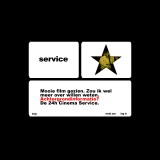
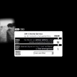
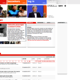
The 24H Cinema Service was developed as one of our first online databases. The system held the information for 35000 movies, not as much as IMDB already had at the time but it was in dutch. It also had access to the data streams of television and movie theater screenings.
Learning suggestion system
Users could let the system issue email warnings if a movie, or an actor they wanted to see would be on tv or in a movie theater. Afterwards, like in IMDB, users could rate the movie. 24HCS had a suggestion protocol in place that learned from a user’s ratings and could serve them with a personal rather suggestion list. This allowed the system to suggest more obscure titles than a global system could have done.
Interface
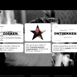
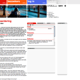
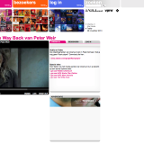
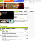
The 24HCS was also one of the first fluid interface designs. It featured percentual table layouts responding to the width of the client, but also nine slice scaling, fat white outlined, round cornered content tables with transparency on top of random picture backgrounds. That made it impossible to use anti-aliasing. You win some you lose some.
An interactive movie cloud was added later on. Netscape layers, animated by javascript, visualized the cloud of related titles to any given movie, allowing a user to browse through a visual network of related movies. The same interface was represented by a static layout with larger and smaller font size titles in Internet Explorer. Cross-browser compatibility wasn’t a thing of pixelmargins then.
Lessons learned
While the technical and graphic features still fill me with pride, the 24HCS failed in another uncharted territory. We never succeeded in making the interface more than a database user interface. A pretty one, but you still had to understand what you were dealing with. Many users would have benefited from a more dialog-based interface rather than a pretty control panel.
The 24H Cinema Service was featured in Website Graphics, the best of global site design. ISBN 90-72007-53-0
work visual design | interaction design | frontend scripting | backend scripting
1999 – parameterized templates

 As more and more makers discovered the internet the workload grew with each season. Keeping all websites uptodate was a lot of work. This was the climate in which MMBase could develop as our first database content management and publishing tool.
Database driven websites are very efficient for bulk publishing, but they often stand in between the designer and the actual content. Before, VPRO titles all targeting different audiences would be represented by their own visual identities.
Lola Da Musica, VPRO’s TV-series about alternative music, had to do with the default template-based site layout as our serious investigative journalism titles. It didn’t reflect VPRO’s playful individuality. It triggered experiments with designs influenced by database ID’s. Modulo translation of ID numbers turned into page background colors. Band photos, uploaded to the content management system, were treated by similar colorizing scripts in ImageMagick and modulo-generated content margins made it possible to parameterize the design for all pages in the website.
Lessons learned
The workload really called for standardisation of our website designs. Coming from a situation where every page was handcrafted this was hard to accept. The decision to let go of complete control over the visual parameters and use content + math to regain some of the websites’ individuality was a gamble, but it totally payed off. It was a critical phase in my transition from a graphic designer to an interaction designer and it really gave me a deeper understanding of database publishing.
work concept | frontend scripting | backend scripting
2010 – New logo
In 2010 design bureau Thonik designed the new VPRO logo, with it came a versatile style guide.
This video shows some of VPRO’s projects and gives an idea of the applicability of the new style guide and the wide variety of media our team works in.
More
 This page is work in progress as I’m going through our archives looking for saved screenshots and more to tell about some of our projects.
Projects
Some of the projects I’ve been working on:
Turbotuig
24H Cinema Service
Van de Schoonheid en de Troost
Cinema.nl
VPRO.nl
Lowlands Heatmap
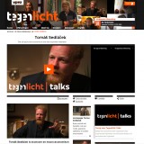
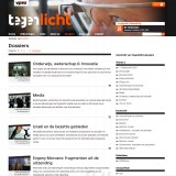
Tegenlicht
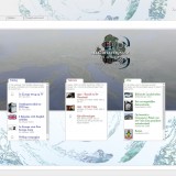
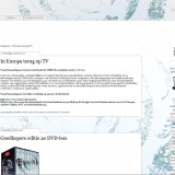
In Europa
Holland Doc
Wetenschap24
3voor12
Nederland van Boven
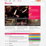
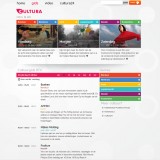
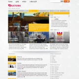
Cultura
